Summary Plots
This section describes the standard plot types that can be generated by mloc. Most plot types are optional (controlled by the command pltt and other commands), but one type of plot (the base plot) is always created and another half dozen or so are routinely used. This section also describes some plots that are variants of one of the basic types. Some additional plot types are referenced here.
Contents
- Base Plot
- Direct Calibration Raypath Plot
- Travel-time plots controlled by command pltt
- Base Plot Variants
- tt5 Variants
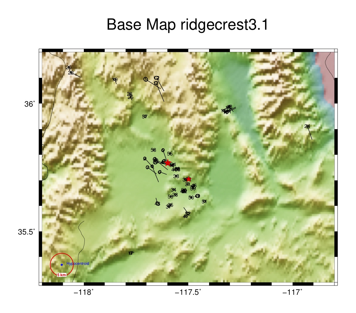
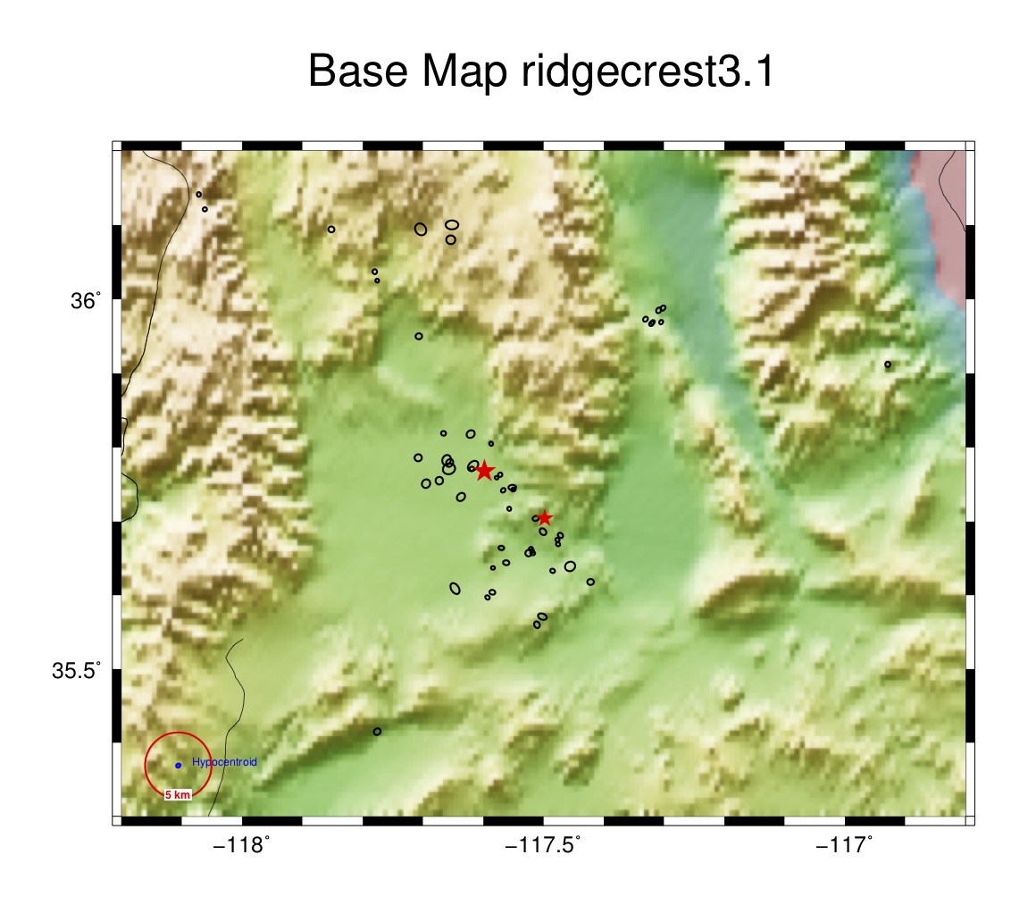
Base Plot (_base.pdf)
One type of plot is always produced by a successful run of mloc, the base plot, which has the file name suffix “_base.pdf”. This is a map of the epicenters with confidence ellipses for the cluster vectors (relative locations). Typically each epicenter also carries vectors showing the change in location from the starting location for the current run of mloc (in green) and the change from the location given in the event data file (in black), which may or may not be the same position. Each epicenter is numbered. The base plot always carries a red circle in the lower left corner with a radius of 5 km, for scale. Other features of the plot, such as the plotting of topography, depend on the action of other commands and the nature of the relocation.
It is important to note that the confidence ellipses shown in the base plot are not the full uncertainty in epicentral location, whether the relocation is calibrated or not. The full uncertainty for individual events results from the addition (as covariance matrices) of the uncertainty in the hypocentroid to that of the cluster vectors for individual events.
Even in an uncalibrated relocation the cluster vectors have meaning in terms of relative locations, but in that case only very broad bounds can be placed on the uncertainty of the hypocentroid. Adding a large, arbitrary uncertainty to the cluster vectors to represent the uncertainty of the hypocentroid would only degrade the resolution of relative locations.
If, on the other hand, the relocation is of the calibrated type and a suitably small uncertainty (1-2 km is typically sought) has been obtained, the addition of the hypocentroid’s uncertainty to that of the cluster vectors does not make much difference. To avoid confusion over the relative contributions of hypocentroid and cluster vector uncertainties I have found it to be more useful to show only the cluster vector uncertainty in the base plot; the full uncertainty in location is carried in other output files.
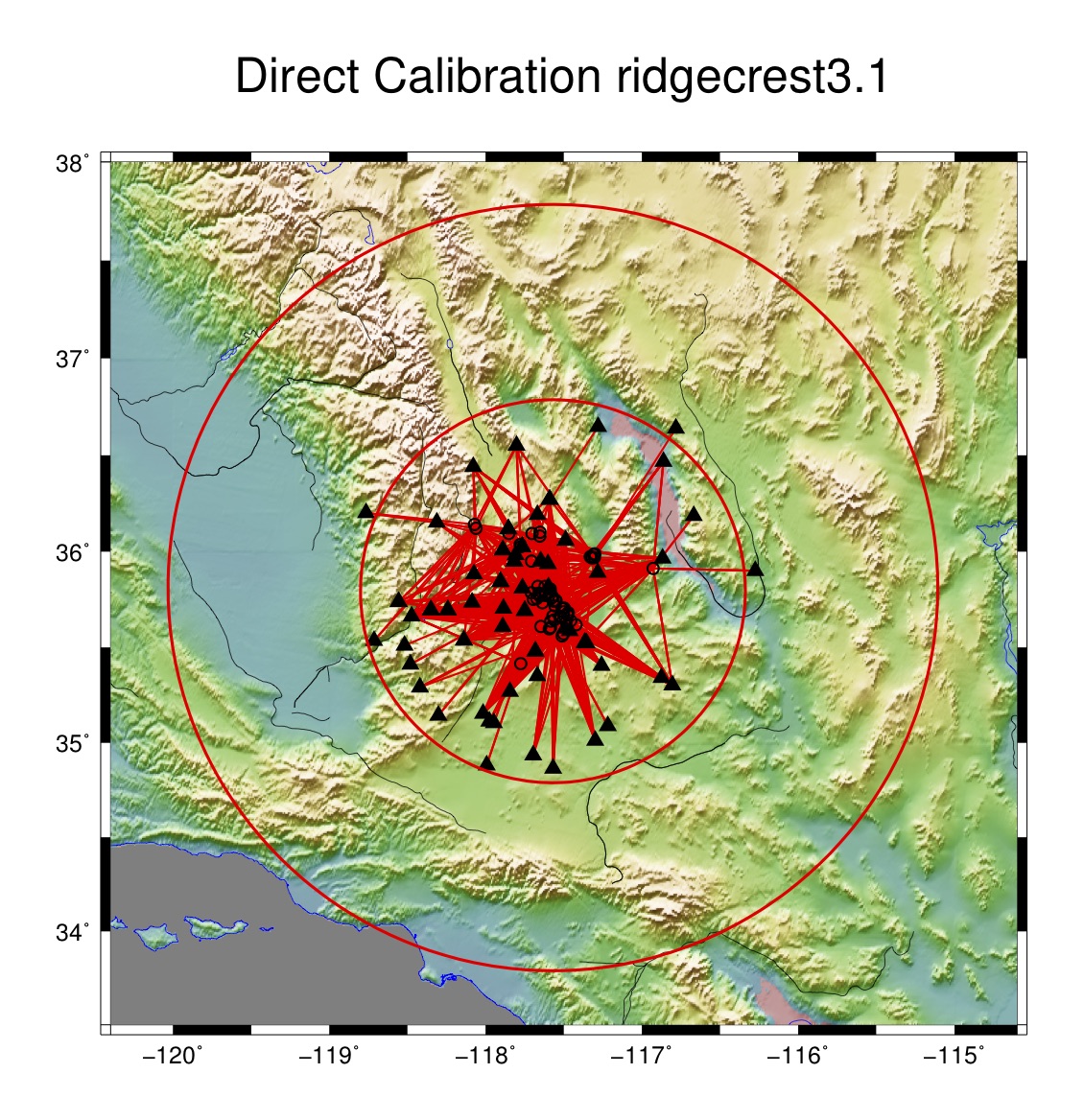
Direct Calibration Raypath Plot (_dcal.pdf)
In mloc, calibrated locations can be estimated in two ways, known as “direct” and “indirect” calibration. The great majority of calibrated relocations are done using the direct calibration method, in which the hypocentroid is estimated using only readings from stations at close range, usually less than the distance of the Pg/Pn crossover in the source region, typically around 100-150 km. When direct calibration is used, mloc always creates a map figure to show the raypaths used for the hypocentroid, with a file name suffix of “_dcal.pdf”.
In this plot, epicenters are shown as equal-sized open circles, stations as filled black triangles, with red vectors for the raypaths. If there are S-P readings the associated stations are shown as open diamonds. Two red circles for scale are centered on the cluster’s hypocentroid, with radii of 1.0° and 2.0°. Plotting of topography is controlled by the command dem1.
Plots Controlled by Command pltt
The command pltt takes one or more integer arguments to control the creation of nine different types of travel time plots, each of which carries a “ttN” nomenclature:
- 1 = tt1, Summary travel time plot, 0-180° (default if no arguments are given)
- 2 = tt2, Entire teleseismic P branch, reduced to the theoretical P time
- 3 = tt3, Around the PKP caustic
- 4 = tt4, Near-source data (range of the hypocentroid data)
- 5 = tt5, local data, 0-4°
- 6 = tt6, local-regional data, 0-30°, reduced velocity
- 7 = tt7, Sg, Sb, Sn, and Lg, 0-15°, reduced velocity
- 8 = tt8, Relative depth phases (pP-P and sP-P)
- 9 = tt9, S-P times
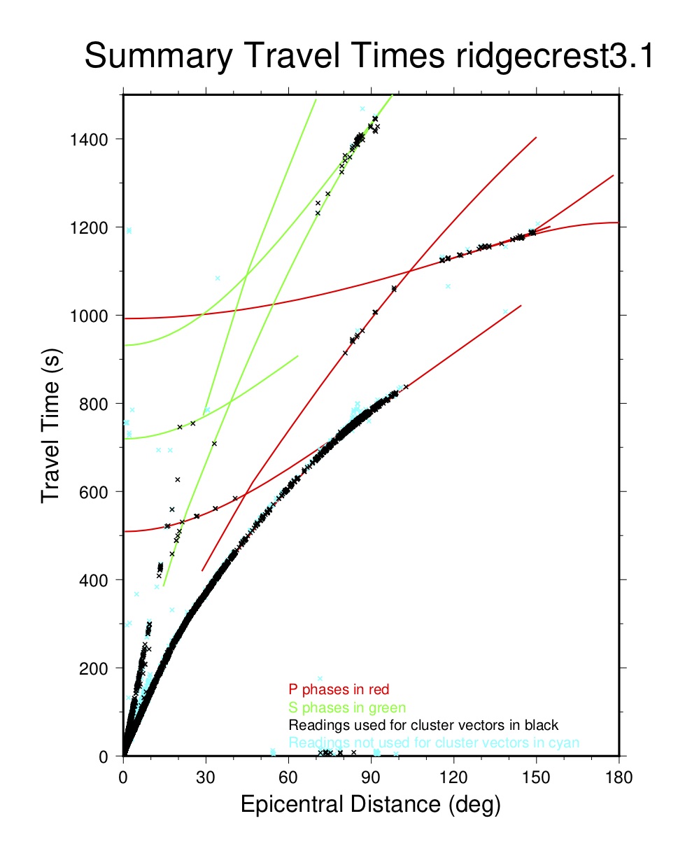
Summary Travel-time Plot (tt1)
This plot displays arrival time data and theoretical TT curves out to 180° and to a travel time of 1500 s. Theoretical curves are from ak135, with depth set to that of the hypocentroid. Curves are yellow for P, PP, Pdiff and core phases; cyan for S, SS, ScP and ScS.
Individual arrival times are plotted in several colors, depending on their use in the relocation:
- Travel times used both for hypocentroid and cluster vectors in red
- Travel times used for hypocentroid, but not for cluster vectors in green
- Travel times used for cluster vectors, but not for hypocentroid in black
- Travel times used for neither cluster vectors nor hypocentroid in blue
Because of the scale of the plot, the red and green symbols are usually barely distinguishable.
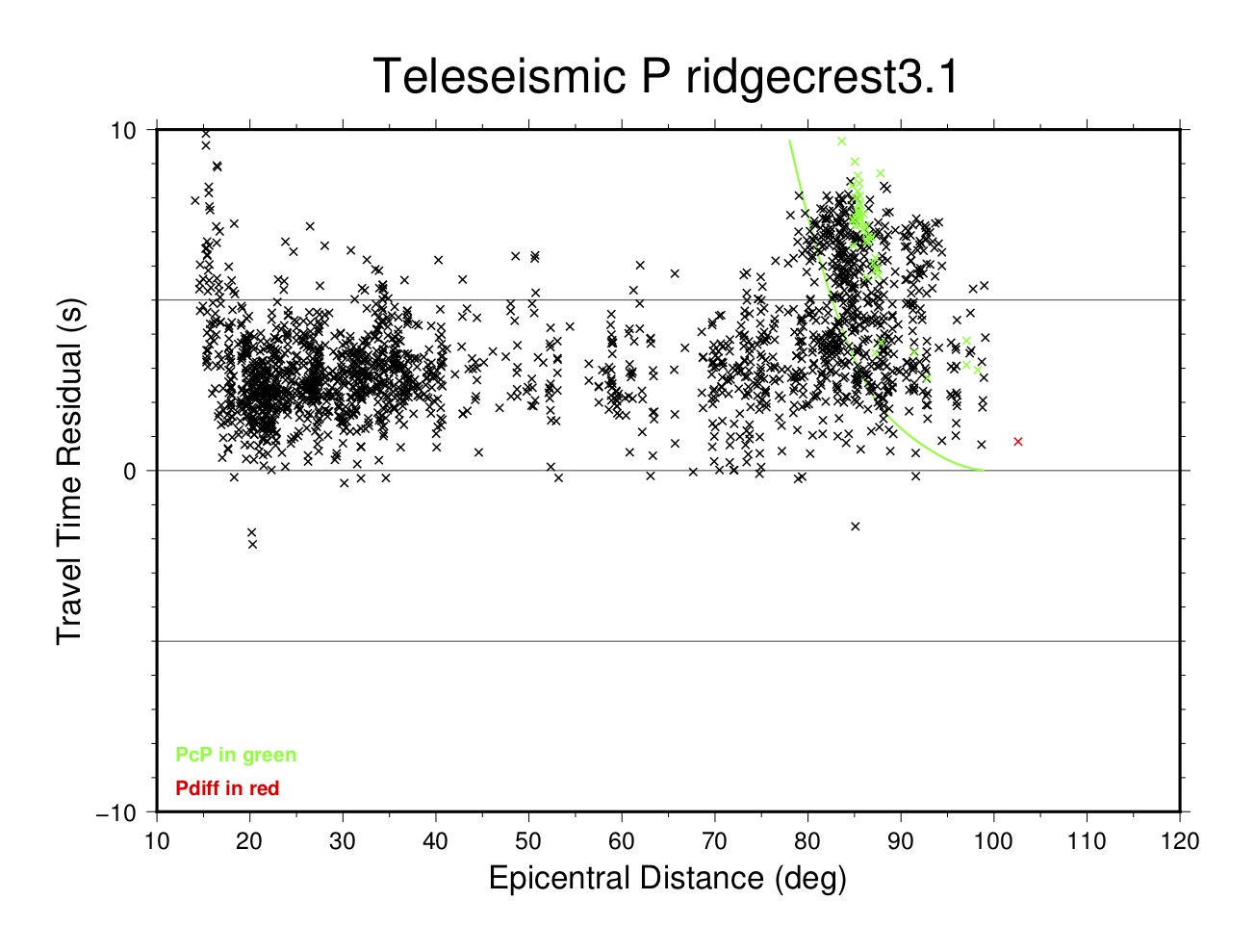
Teleseismic P Plot (tt2)
This plot displays P phase arrivals from 10-120°, reduced to the theoretical time from ak135 (for the depth of the associated event). A green line indicates the theoretical arrival time of PcP, with which there can be confusion near a distance of 80-85°. Pdiff arrivals are plotted in red.
PKP Caustic Plot (tt3)
This plot shows arrivals near the PKP caustic between 135-160°. Theoretical curves and symbols for arrivals are color-coded:
- PKPdf in black
- PKiKP in green
- PKPab in blue
- PKPbc in red
- Anything else in cyan

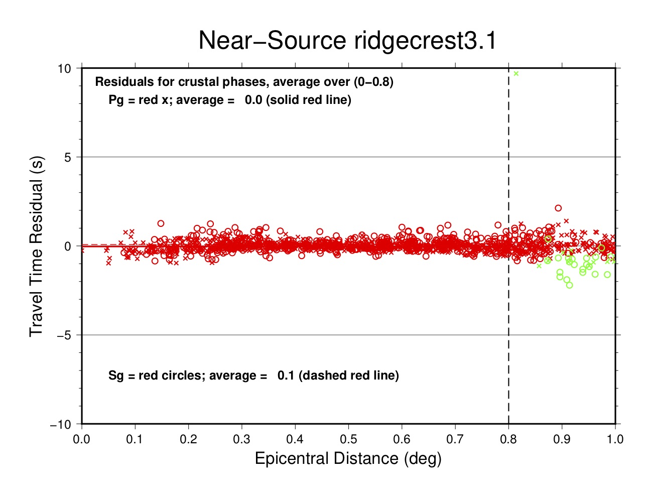
Near-Source Plot (tt4)
This plot displays the residual of each arrival in the distance range used for estimating the hypocentroid (indicated by a vertical dashed line). Symbols for different phases are:
- Pg in red crosses
- Pb in blue crosses
- Pn in green crosses
- Sg in red circles
- Sb in blue circles
- Sn in green circles
For each phase, the average residual (over the distance range used for the hypocentroid) is calculated and listed.
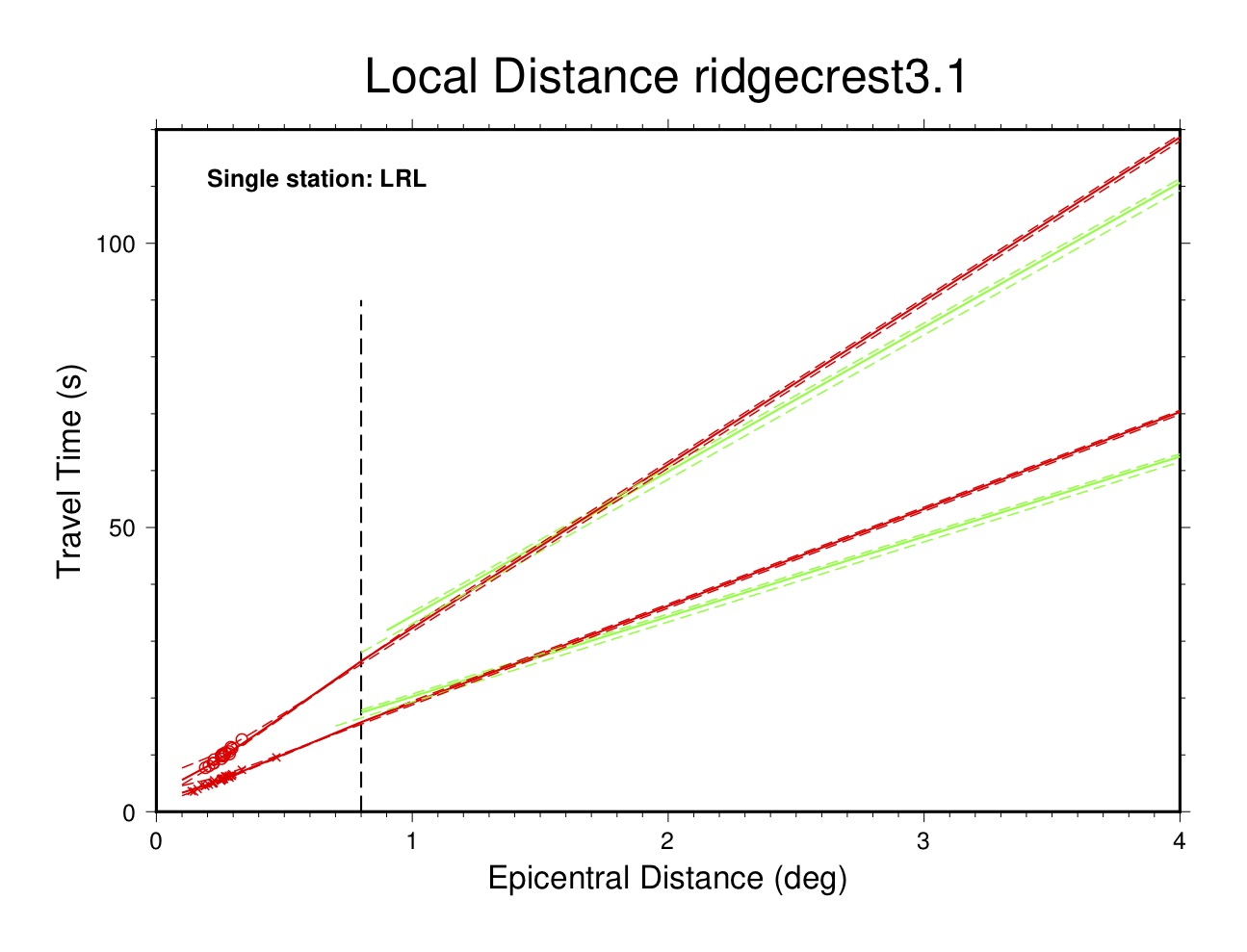
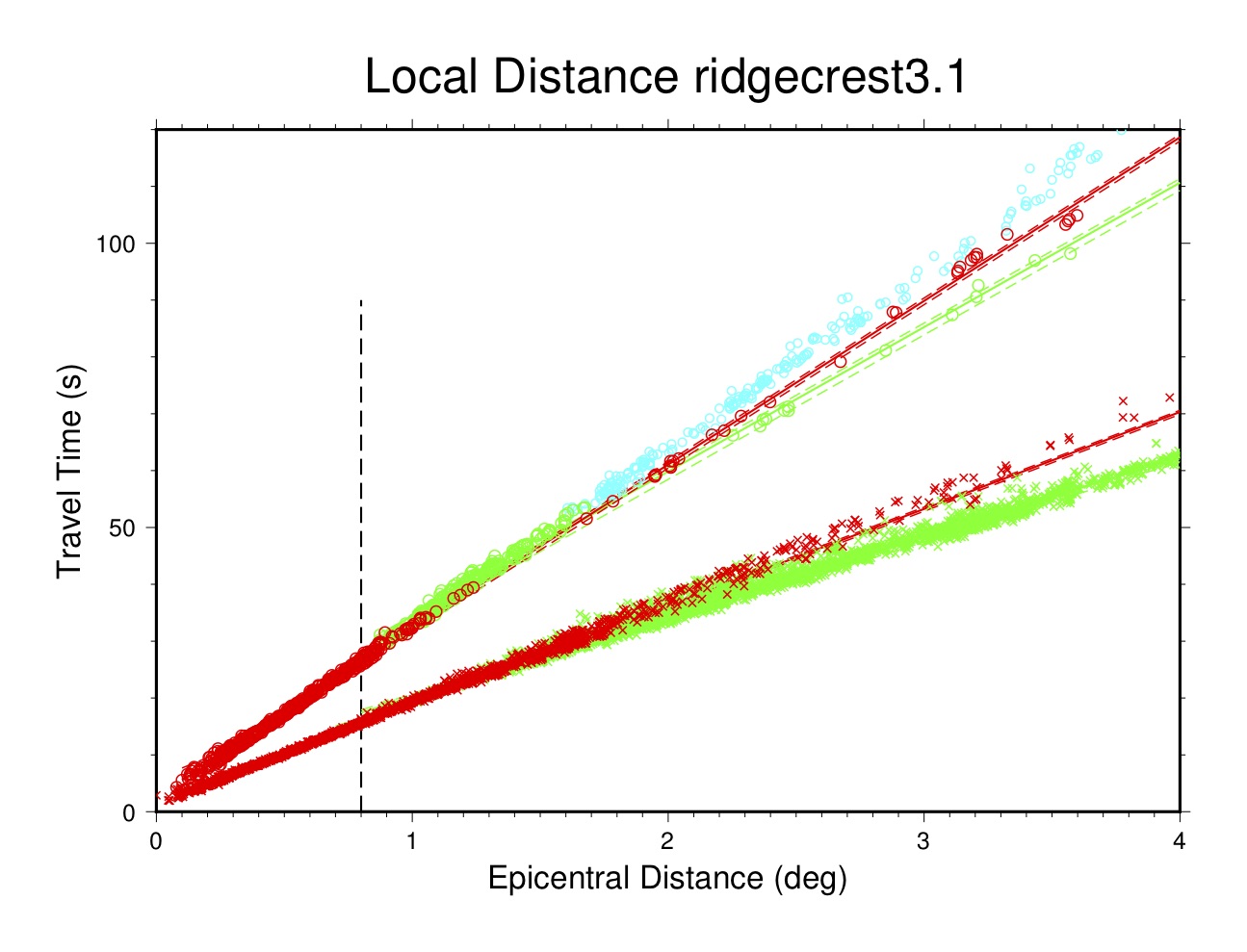
Local Distance Plot (tt5)
This plot displays the travel-times of data over the distance range 0-4°. In most cases the theoretical travel times are based on a custom flat-layered model developed for this particular cluster to match the observed arrival time data. Travel times for Lg are calculated separately within mloc, using either a default travel time or one specified by the user, based on the fit to observed data. Otherwise the theoretical travel times would be based on the ak135 global model. Symbols for different phases are:
- Pg in red crosses
- Pb in blue crosses
- Pn in green crosses
- Sg in red circles
- Sb in blue circles
- Sn in green circles
- Anything else (mainly Lg) in cyan circles
A vertical dashed line is drawn at the distance limit used to estimate the hypocentroid.
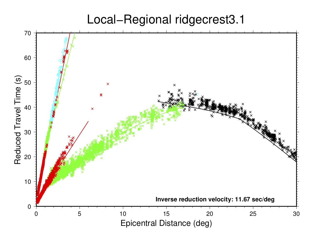
Local-Regional Plot (tt6)
This plot displays the travel times of data out to 30°, in a reduced velocity plot for legibility. The reduction velocity (11.67 sec/deg in inverse form, or 350 seconds at 30°) has no physical meaning. Symbols for different phases are:
- Pg and Sg in red crosses
- Pb and Sb in blue crosses
- Pn and Sn in green crosses
- P in black crosses
- Everything else (mainly Lg) in cyan circles
In most cases the theoretical travel times for local and regional phases are calculated from a custom flat-layered model derived for the particular cluster to fit the observed data. Travel times for Lg are calculated separately within mloc, using either a default travel time or one specified by the user, based on the fit to observed data.
The travel time curve for teleseismic P is taken from the ak135 global model. Phase identification at the Pn-P crossover is usually less than optimal, but in most cases it is not worth the effort to manually correct the results of the automatic phase identification algorithm in this distance range, where only relative travel times are used in the relocation.
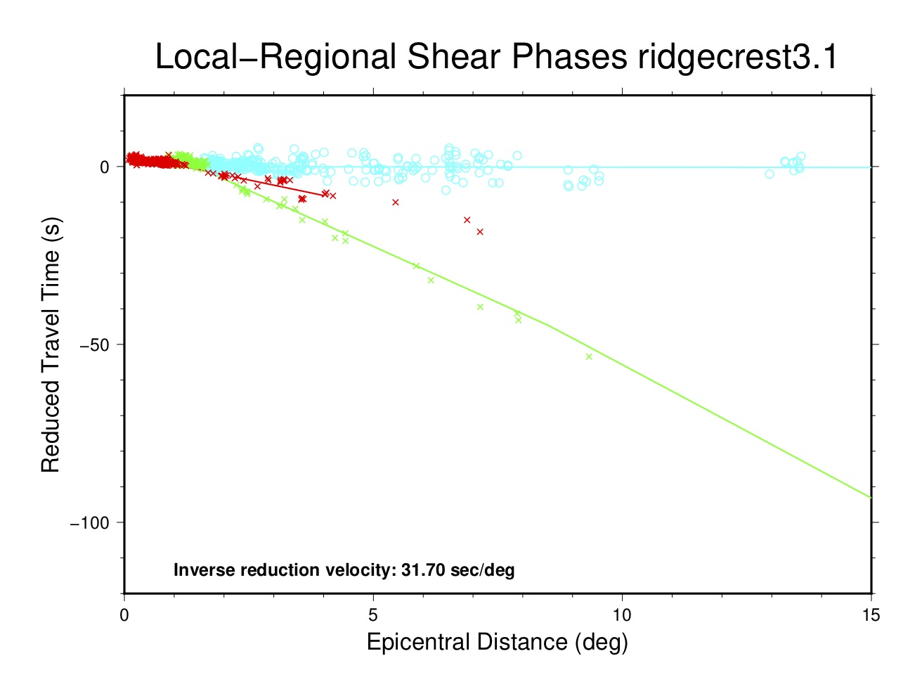
Local-Regional Shear Phases Plot (tt7)
This plot displays the travel times of shear phases out to 15° in a reduced-velocity plot (31.7 sec/deg, ~3.5 km/s). Symbols for different phases are:
- Sg in red crosses
- Sb in blue crosses
- Sn in green crosses
- Lg in cyan circles
In most cases the theoretical travel times for these phases are calculated from a custom flat-layered model derived for the particular cluster to fit the observed data. Travel times for Lg are calculated separately within mloc, using either a default travel time or one specified by the user, based on the fit to observed data. Otherwise the ak135 global model would be used.
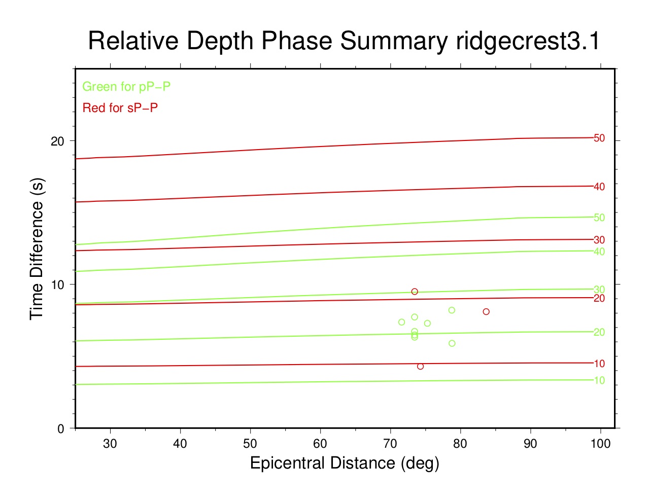
Relative Depth Phase Summary Plot (tt8)
This plot displays all relative depth phase (pP-P, sP-P) observations for all events in a cluster to assess the likely range of focal depths. Because of the baseline offset that is normally observed for the travel times of teleseismic P phases (and depth phases) in calibrated clusters, it is not feasible to use depth phase arrival times by themselves to constrain depth. In mloc these data are converted to relative depth phase data, e.g., pP-P times.
The plot displays the value of relative depth phase observations as a function of epicentral distance. Theoretical curves (green for pP-P, red for sP-P) are drawn over the distance range at a range of depths to assist in evaluating the range of depths for the events in the cluster.
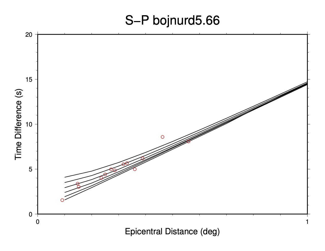
S-P Plot (tt9)
These plots display observations of S-P times. S-P data must be entered explicitly in an event’s MNF file; it is normally only used when P and S arrivals are available from stations for which the timing systems are known to be uncalibrated or suspected of being miscalibrated. The plot displays S-P time on the vertical axis and epicentral distance (to 1.0°) on the horizontal axis. Theoretical curves for S-P are shown for focal depths of 5, 10, 15, 20, 25 and 30 km. Readings are shown as red open circles.
Other Plots
Several other plots can be made from mloc with specific commands.
Confidence Ellipse Plot (command eplt)
This plot is based on the base plot but shows only the confidence ellipses, i.e., no event numbers or relocation vectors.
Seismicity Plot (command splt)
This plot is similar to the base plot but shows locations with same-sized symbols and no indication of location uncertainty or relocation vectors. I do not find this plot very useful but it does allow for an easier comparison with the typical presentation of earthquake locations.

Selected Event Plot (command plot)
Using the command plot the user can select individual events from a cluster for plotting in a base map (the boundaries of which will be scaled to the distribution of the selected events). This is often used to provide better visualization of a short series of related events within a large cluster. The command can be used multiple times and the resulting plots have filename suffixes of “_sel1.pdf”, “_sel2.pdf”, etc.

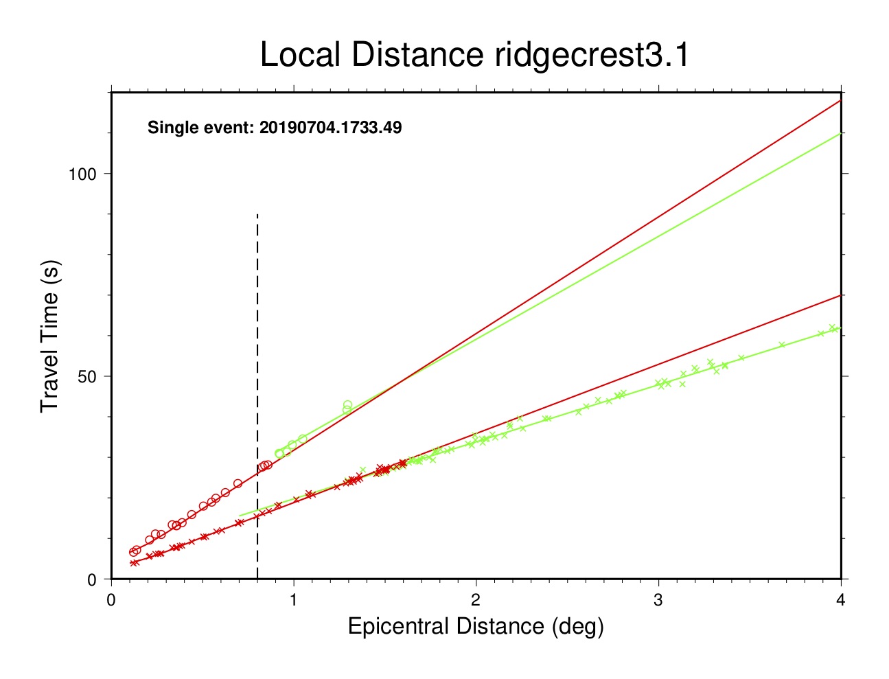
Single Event, Local Distance Plot (command tt5e)
This plot is similar to the local event plot (tt5) but shows arrivals only for a specified event. Useful for investigating an event that is misbehaving, e.g., failing to converge or ending up with a dubious location.
Single-Station, Local Distance Plot (command tt5s)
This plot is similar to the local distance plot (tt5) but shows arrivals only for a specified station. Useful for investigating possible incorrect station coordinates or a timing problem, sometimes for phase identification problems.