~_epa Plots
Plots of empirical path anomalies are made by the epap command. They are gathered in a subdirectory of the cluster series directory named ~_epa and have names like ~_epa_N.pdf, where “N” is an index number for multiple instances of the command. This is a map plot that displays the empirical path anomalies for a selected phase over a selected distance range.
Empirical path anomalies are taken as the mean of residuals for a given station-phase pair in a calibrated relocation. When used for Pg or Sg this plot can be helpful in evaluating the data being used for direct calibration, especially if you suspect that a station may have incorrect coordinates or a timing problem. It is very interesting to plot Pn path anomalies with this command, as you will usually see distinct patterns of early and late arrivals related to gross changes in crustal structure. This is why it is very dangerous to use Pn arrivals for location. Here is an example, showing empirical path anomalies for the Pn phase to a distance of 15° epicentral distance for the Ridgecrest cluster in California.
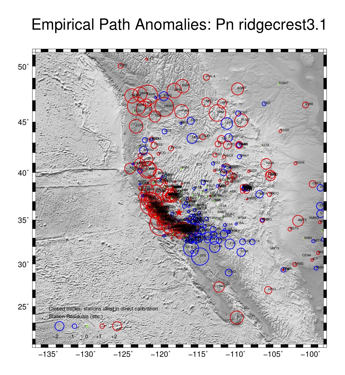
There is an option to the epap command that controls whether of not raypaths are plotted. When there is a large amount of data, as for Ridgecrest, it is usually better to leave the raypaths off. Late arrivals are shown in red, early ones in blue, with symbol size scaled according to the magnitude of the empirical path anomaly. Station codes are printed too.